-
Strategy & brand positioning
-
Print : stationary / brochure / packaging / point of sale / marketing collateral
-
Photography & art direction
-
Digital : website design & development / email marketing / social media / content creation
-
Videography
-
Analysis & reporting
-
Advertising: Outdoor Billboards / Magazine / Press
-
Strategy & brand positioning
-
Print
-
Digital
-
Photography & art direction
-
Videography
-
Analysis & reporting
the brief - THINK FIRST
In many ways this brief was simple. Create a brand and marketing approach that epitomised the Anti-Builder. We are not like other builders. Sure everyone says that. But how were we going to be able to live it.
To find the solution to this puzzle we had to first understand what other builders stood for, what they did and how people were frustrated with the status quo.
Other builders sold the dream home. We were selling the dream of owning a home.
Flashiness vs Simplicity.
Details vs Transparency.
Expensive vs Affordable.
Confusing vs Easy to use.
Research told us that people were frustrated with being shown an amazing home image with extremely low prices, that were only for the base model. People just wanted to know the price without having to give their details, go through a screening process, and then be harassed by sales consultants.
We believed that if we gave the people what they wanted, in an honest, simple and transparent way, they would have the information they needed to make the choice. And then we backed our product and service enough to believe that they would choose us.
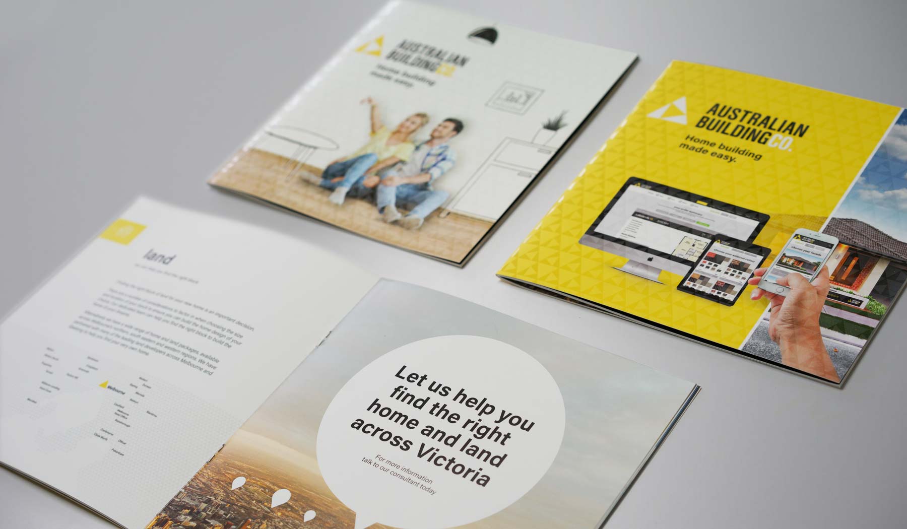
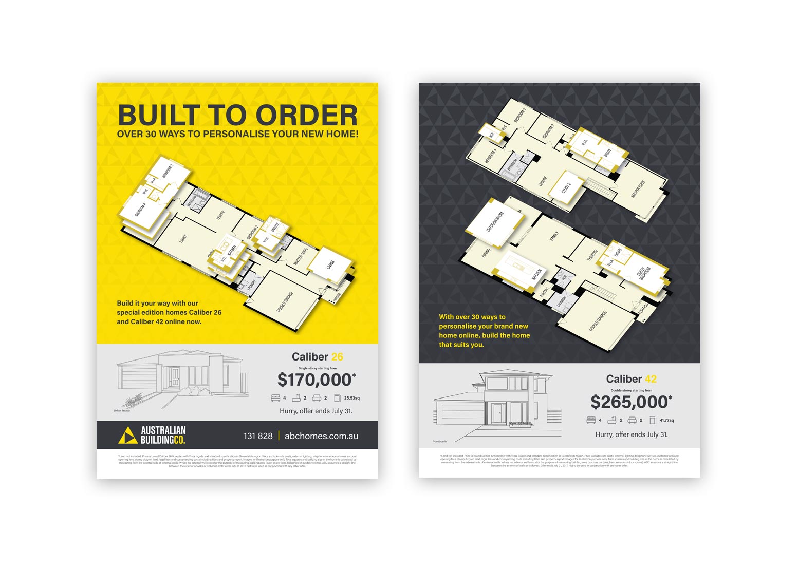
So we decided to keep this principle in everything we did - from logo, to promotions, to product brochures. Our goal was to simplify.
brand approach
The single most important aspect for this builder was to put people into their first home. Whilst many builders are trying to sell the dream home, we were trying to sell the dream of owning a home.
To do this, we had to approach the brand visualisation with the same perspective.
Whilst in one sense we were trying to be the anti-builder, there were still elements, traditional to the industry, that we had to encompass. Our brand had to install a sense of stability and trust whilst simultaneously elicit feelings of progressiveness and simplicity. To encapsulate simplicity we chose a name that was, in itself, transparent. We told our customers exactly what we did. No mess no fuss. We are The Australian Building Company.
iconography
Drawing inspiration from the A in Australian, our logo started with the forward facing triangle, symbolising our progressive nature. This was encased in a pyramid triangle, symbolising our solid and reliable nature. This creates a rotating series of 3 triangles to elicit a sense of revolution, change, and of doing things differently. Providing the perfect balance between stability and movement.
patterning
By using the icon in a pattern structure in backgrounds, on spot-gloss laminates and in animations, we were able to increase the viewers exposure to our iconography. Instead of viewing the brand once, they were viewing it hundreds of times in each piece of collateral, without being overpowered by it. This increased memorability and recognition of our brand in an industry that has extremely high levels of competitive communication.
type & colour
Combined with the bold approach to type, we chose a simplistic yet striking colour palette. A primary yellow to command attention and muted greys and blacks to create a foundation. The brand presence was unmistakable, memorable and stood for what we believed.
messaging strategy
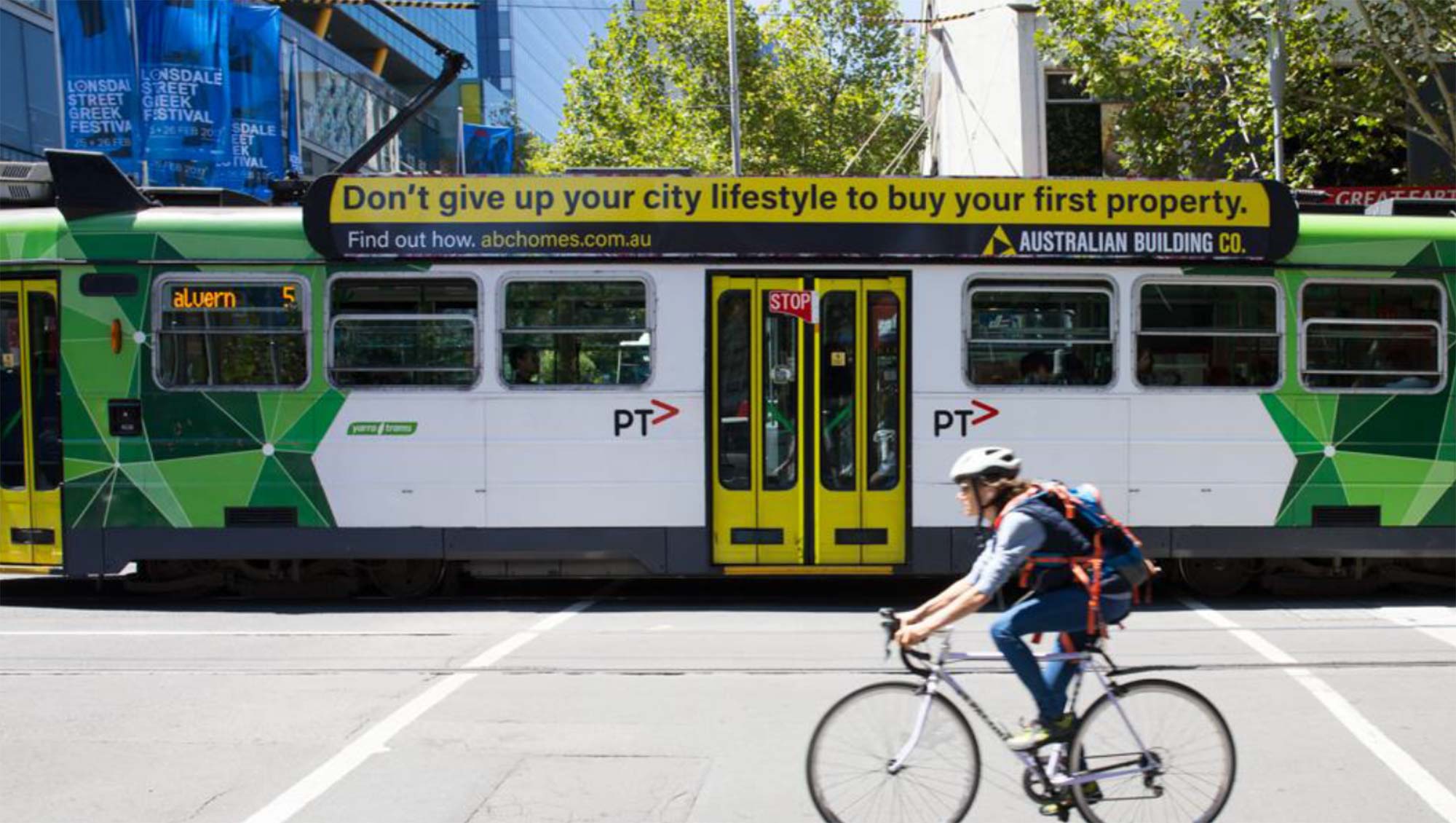
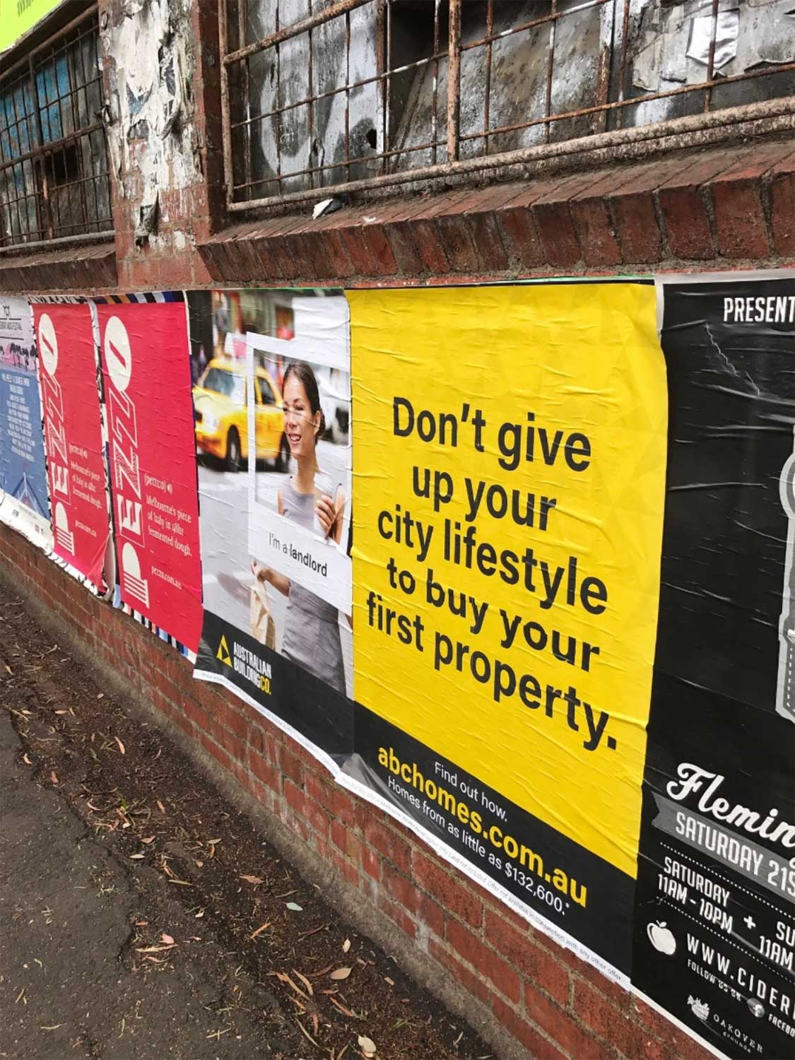
Our communication strategy was simple, keep it simple!
Don’t use 4 words where 3 will do.
Don’t use fancy words or try to sound sophisticated.
Find the simplest, easiest, most straight to the point way of communicating.

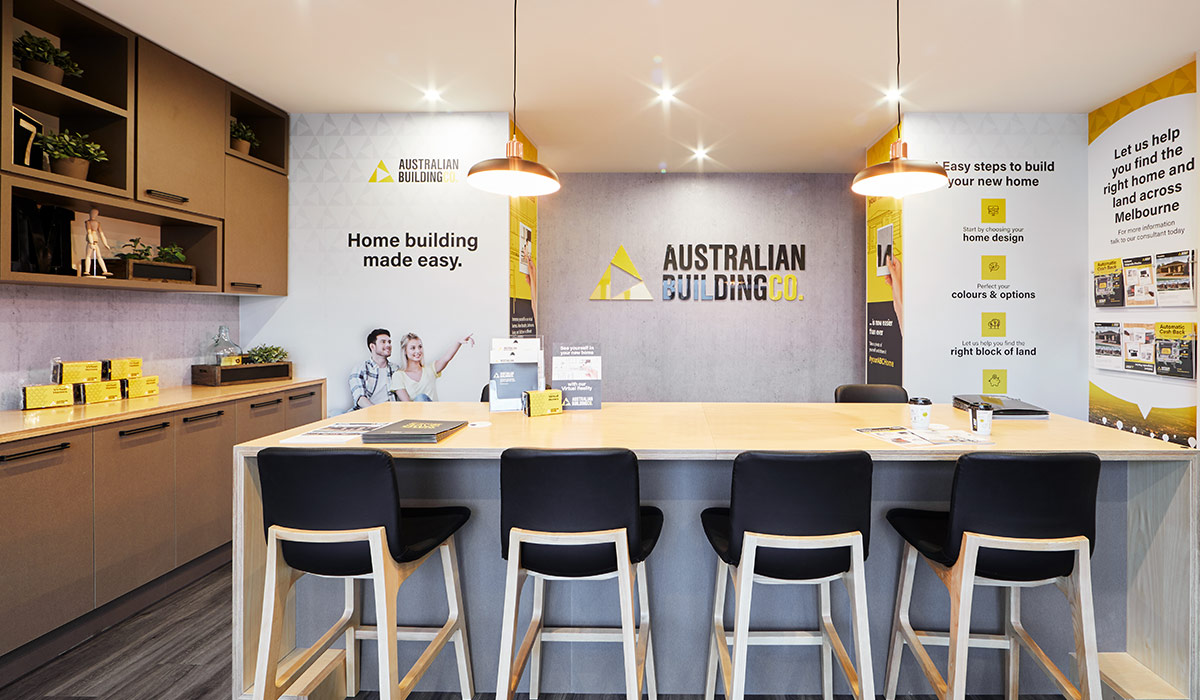
Display home signage
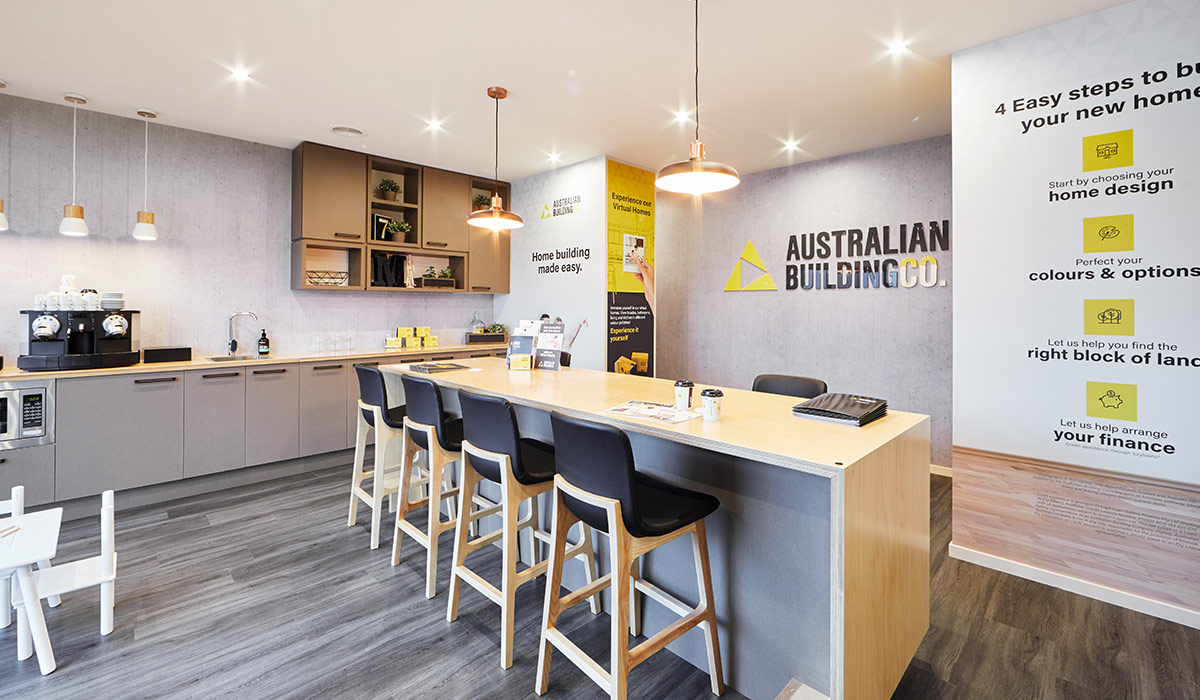
Our design approach focused on creating a communal area instead of a sales office. Where families could browse and chat with our New Home Advisors in an inviting, comfortable space.
Campaign
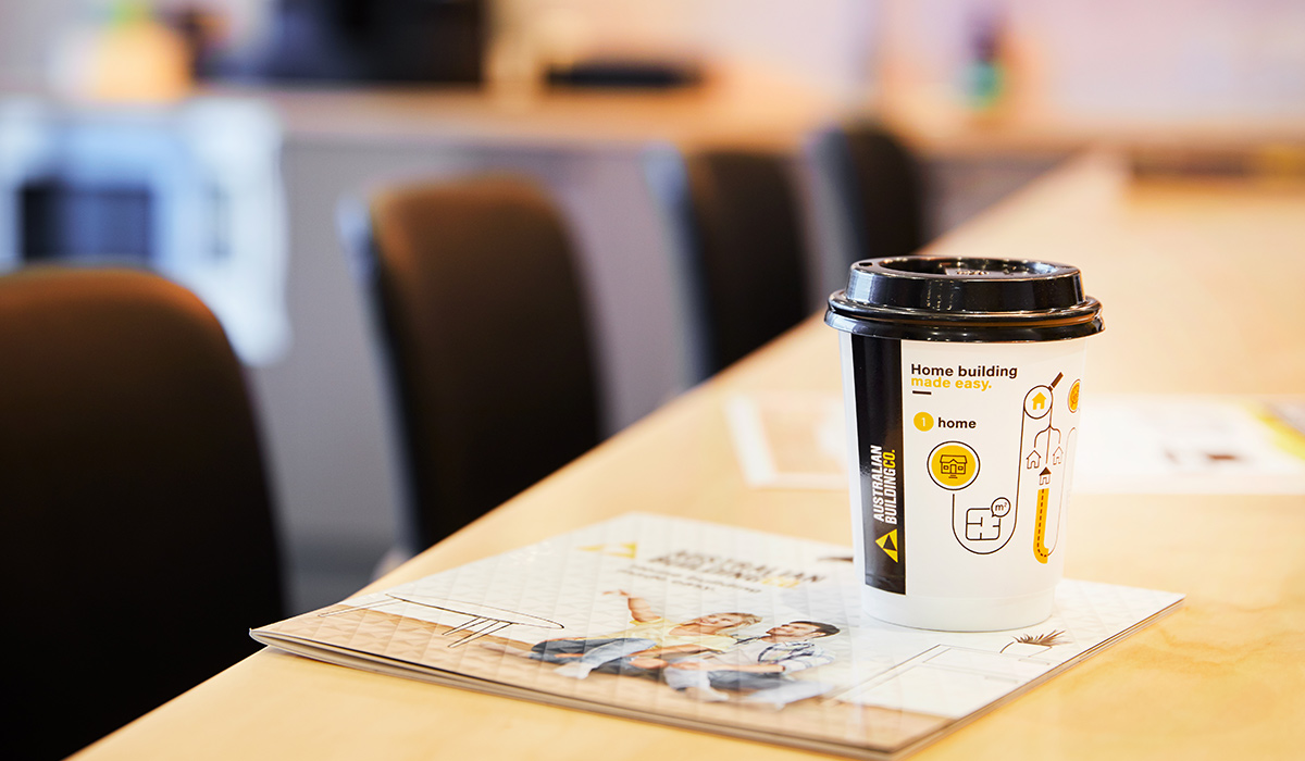
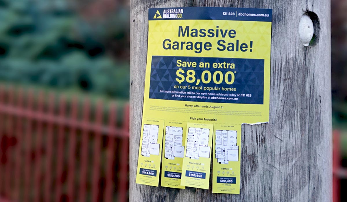
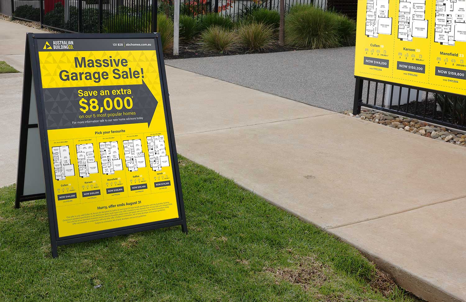
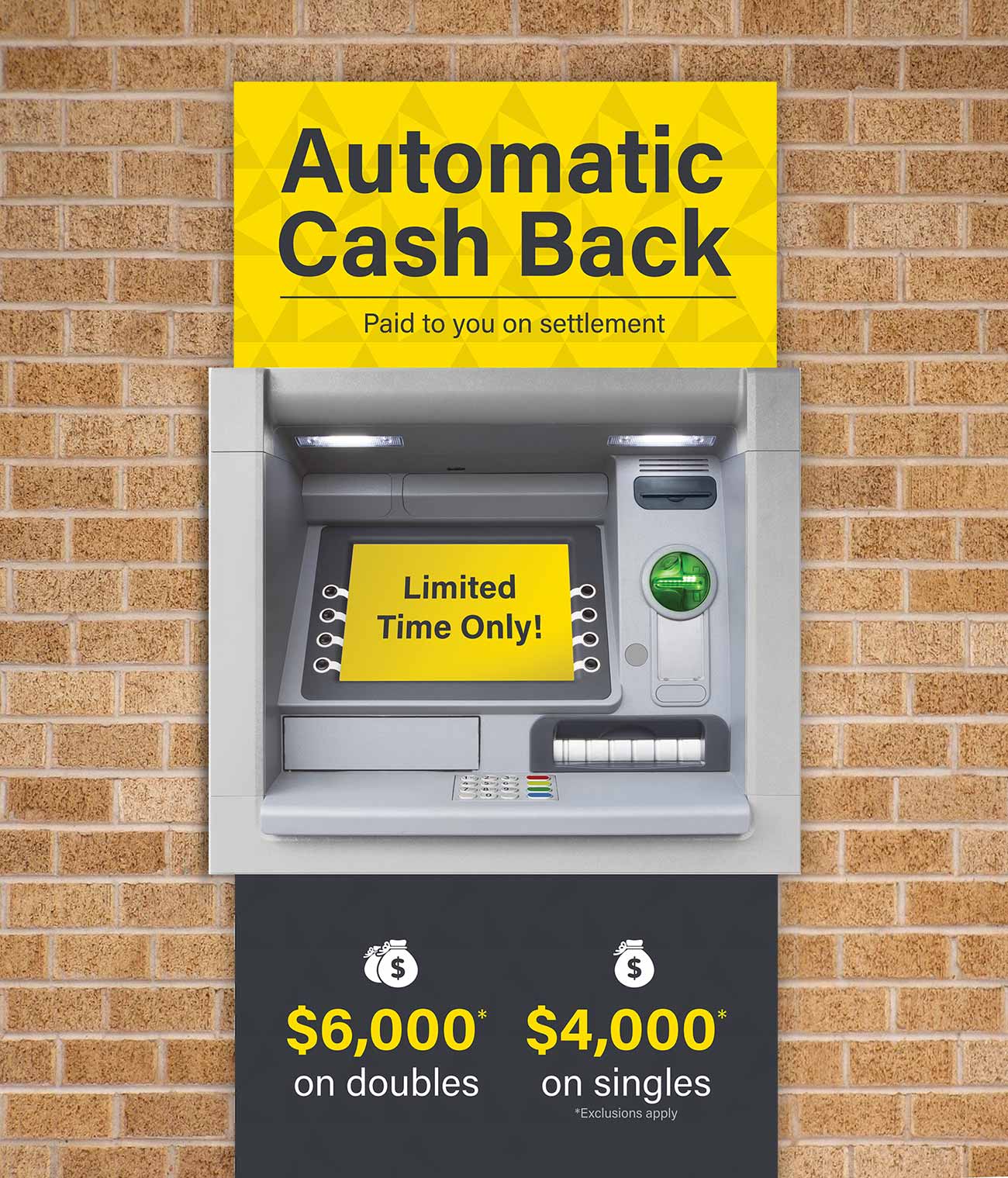
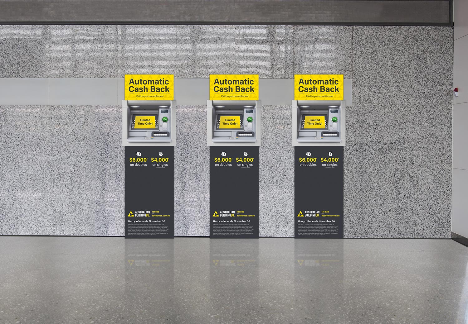
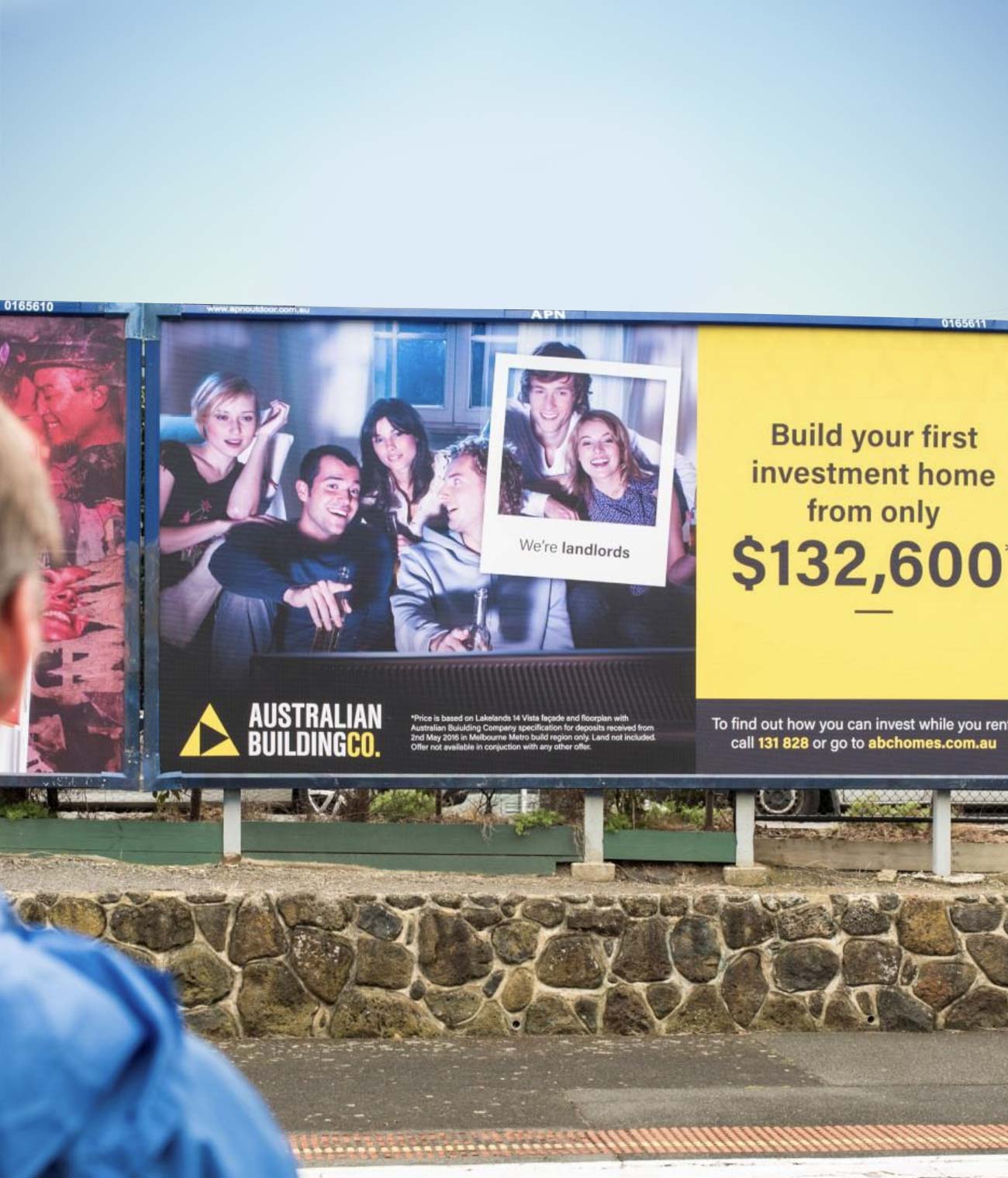
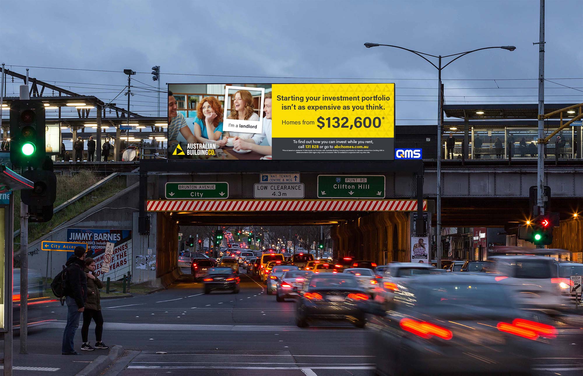
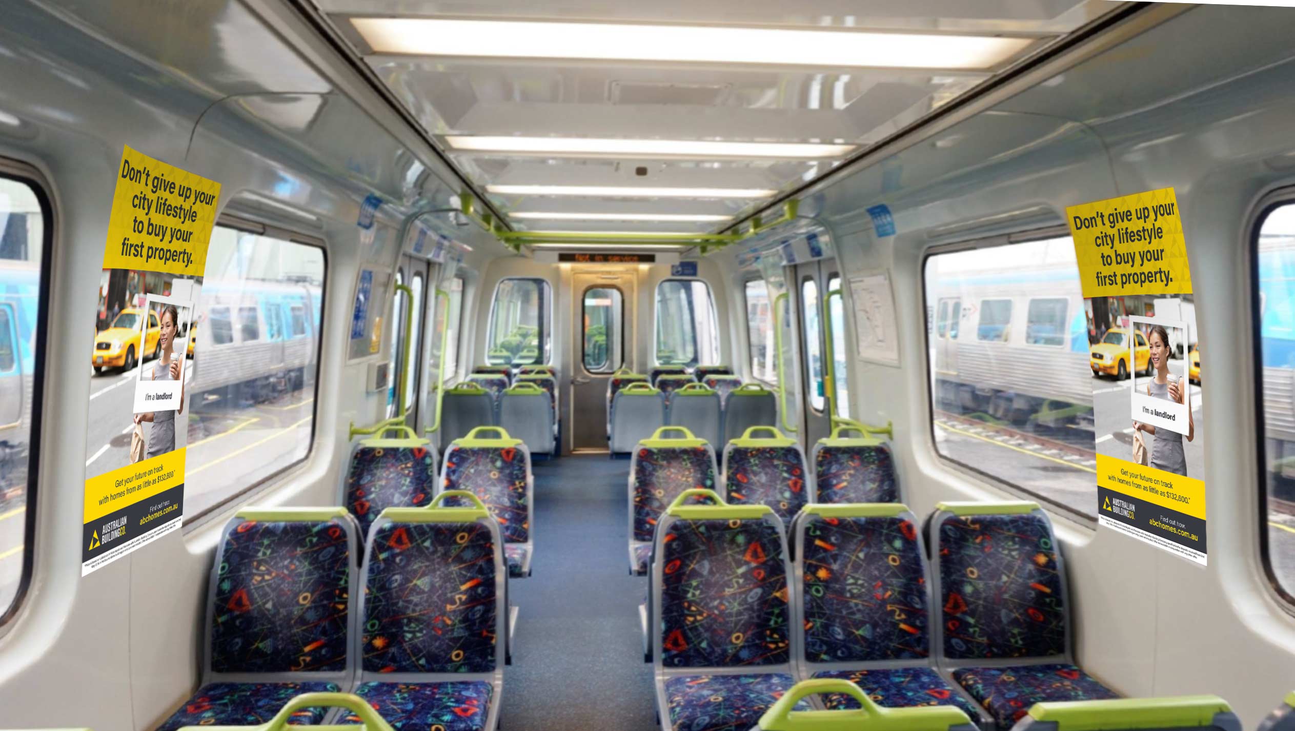
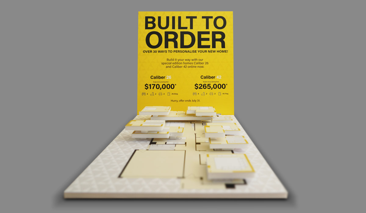
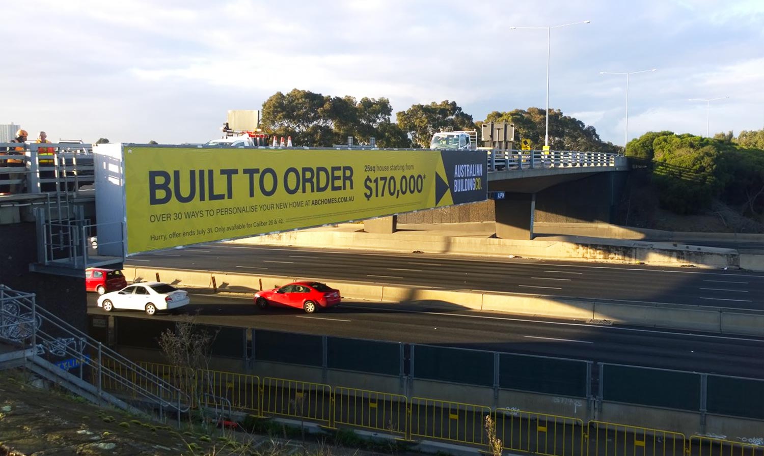
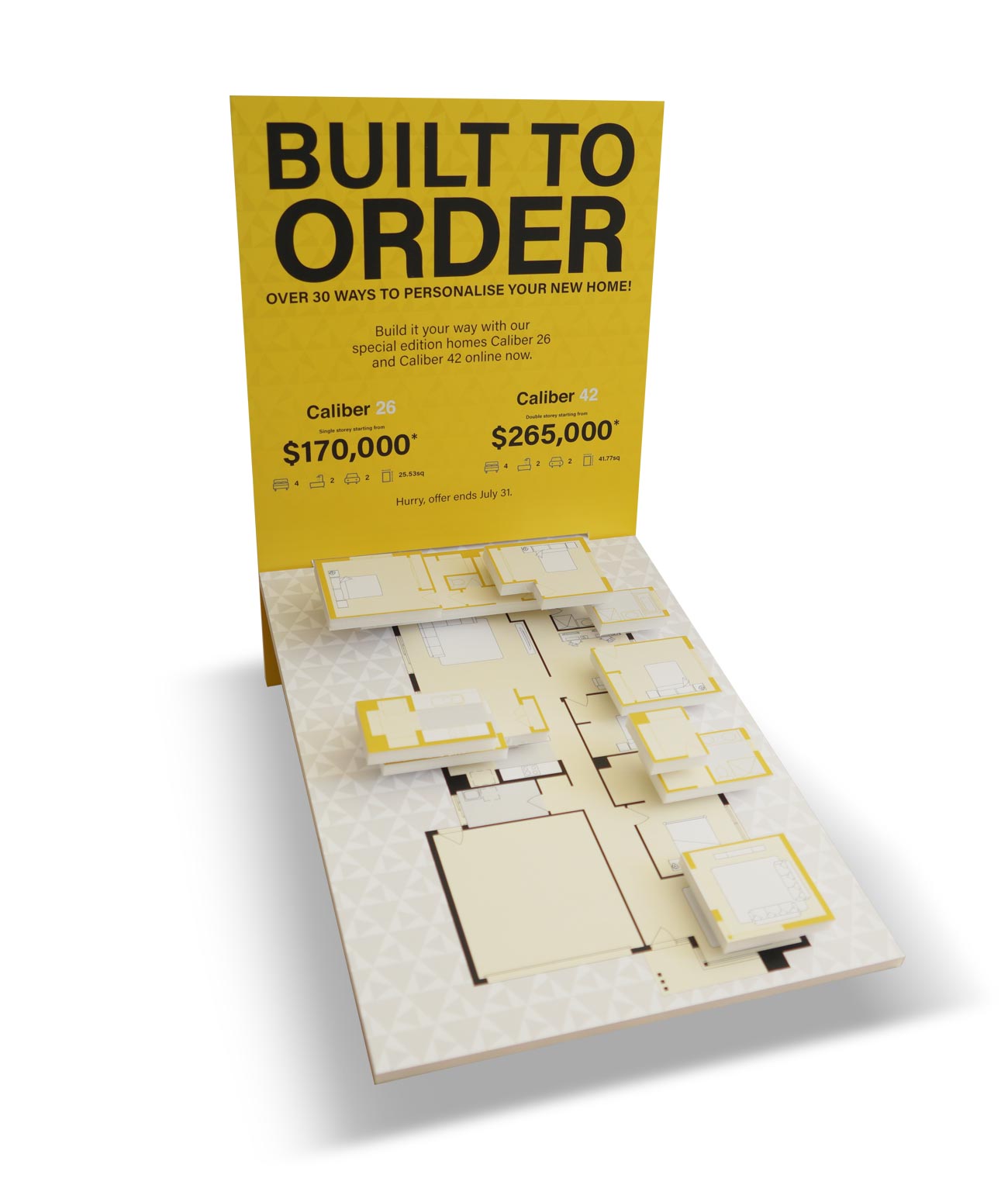
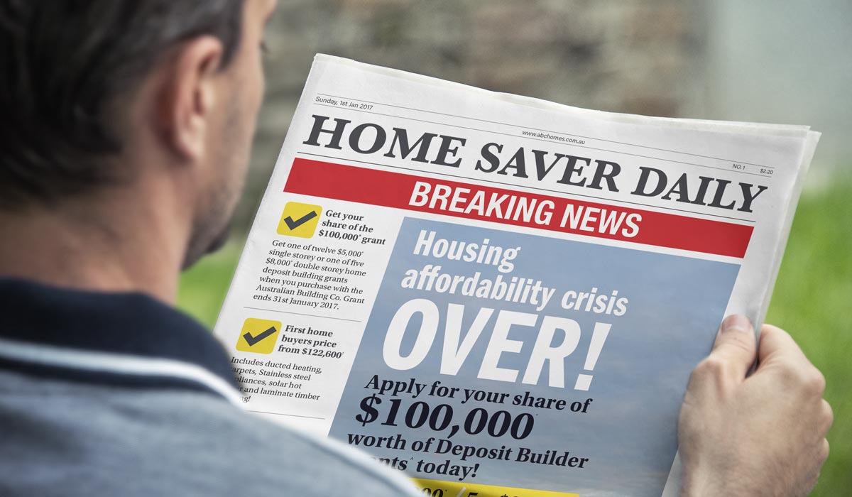
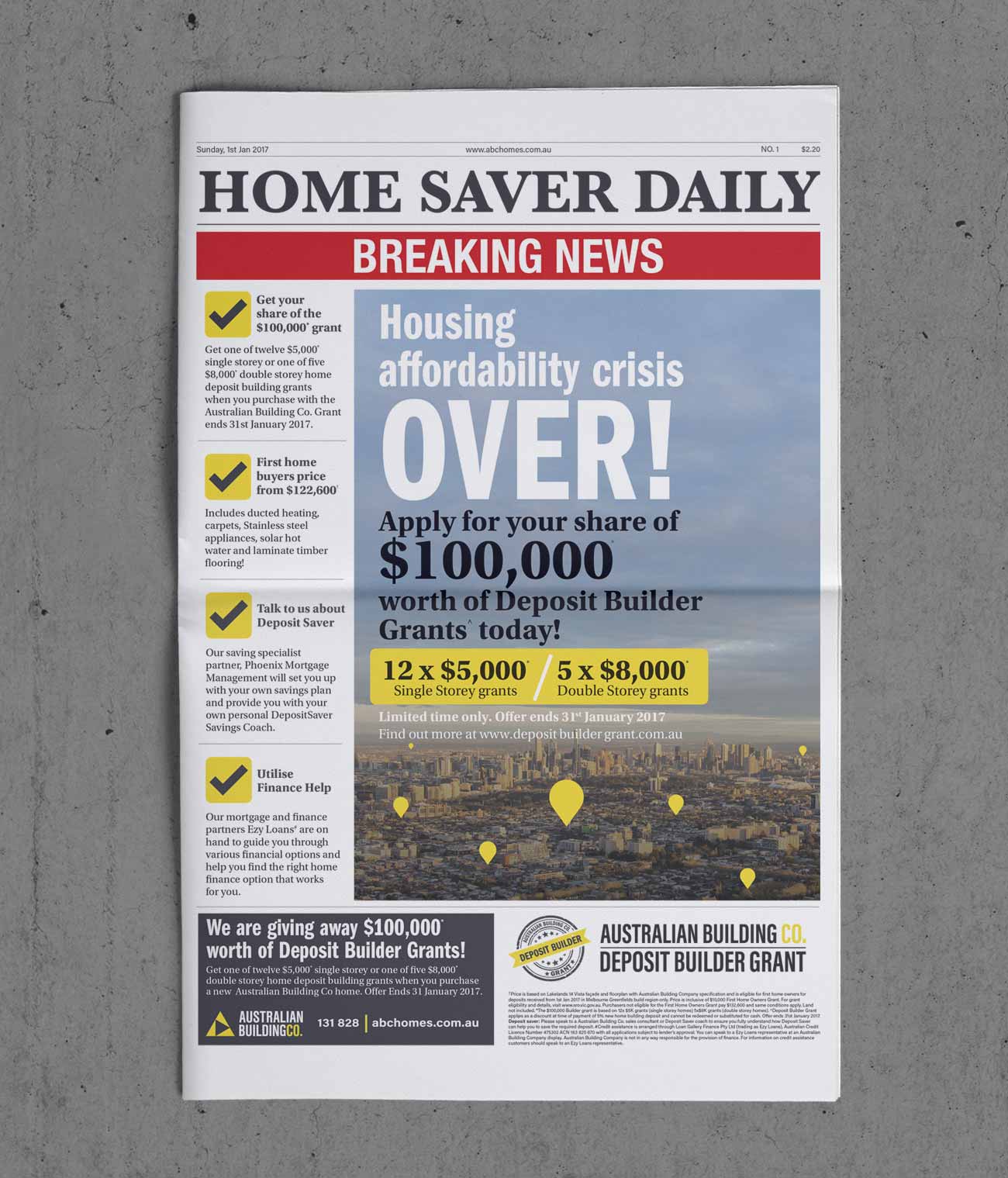
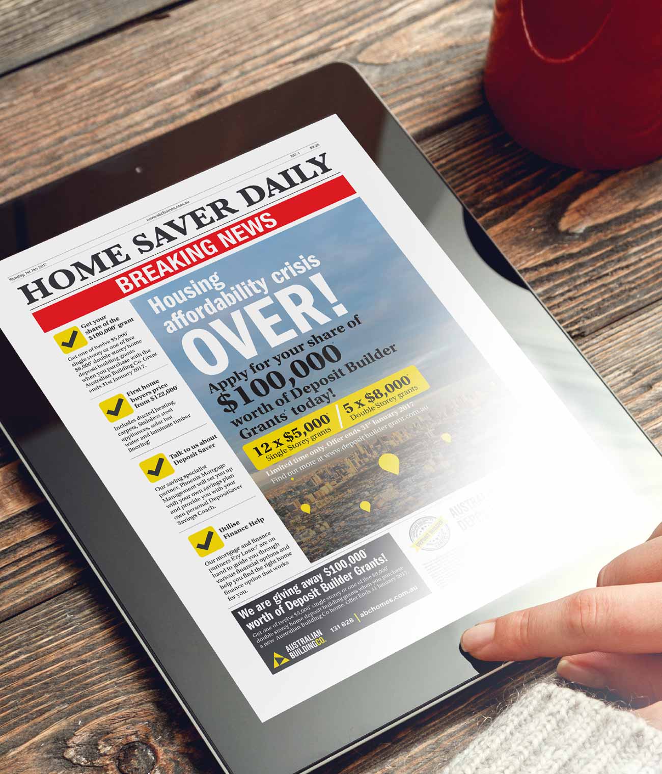
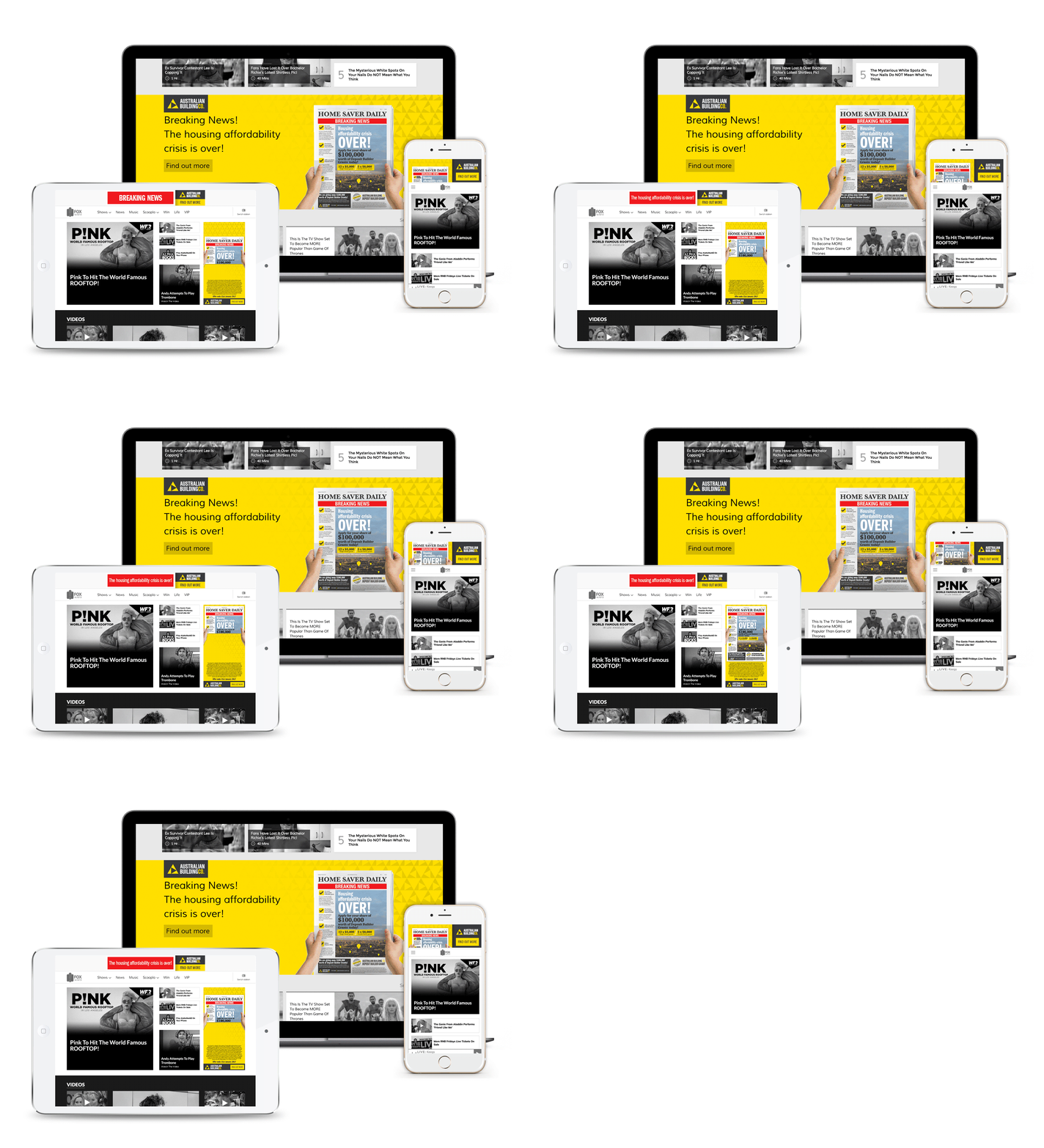
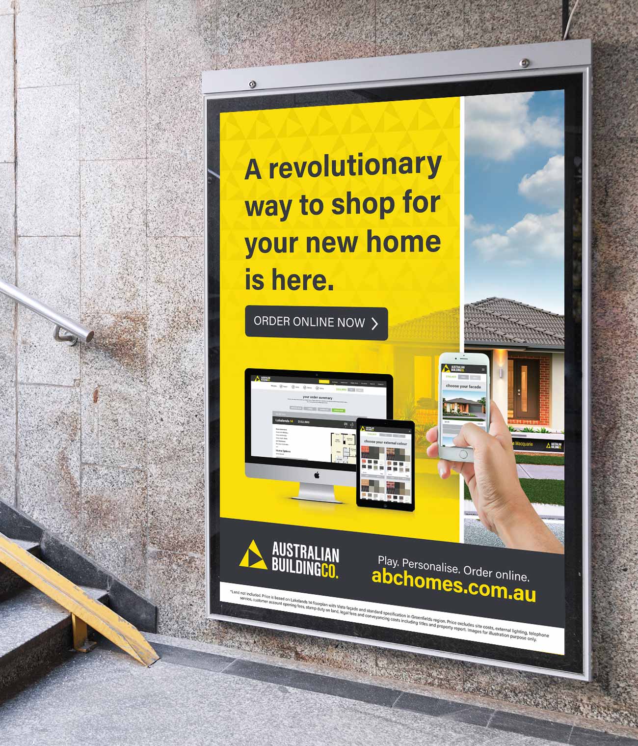
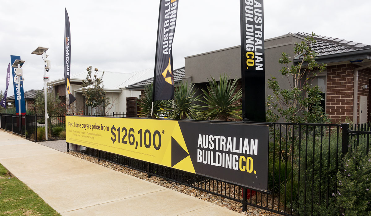
The brand was then marketed through a combination of outdoor, digital marketing, social media, and point of sale campaigns to drive brand awareness and generate leads.
website approach
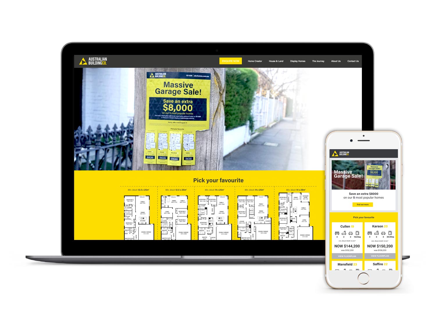
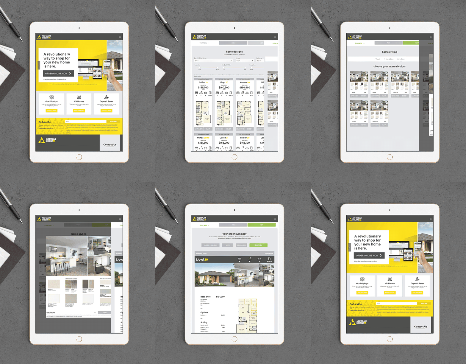
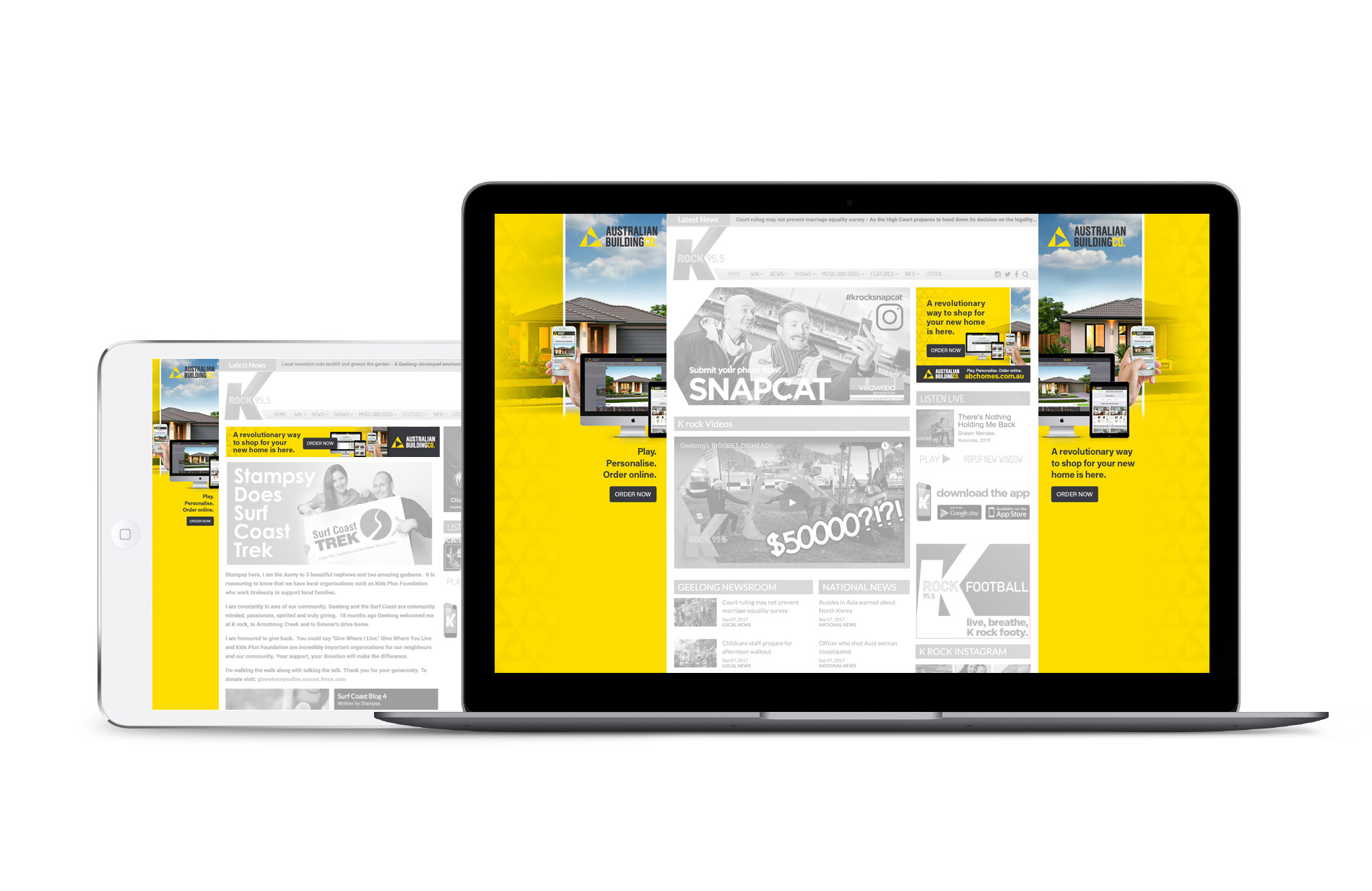
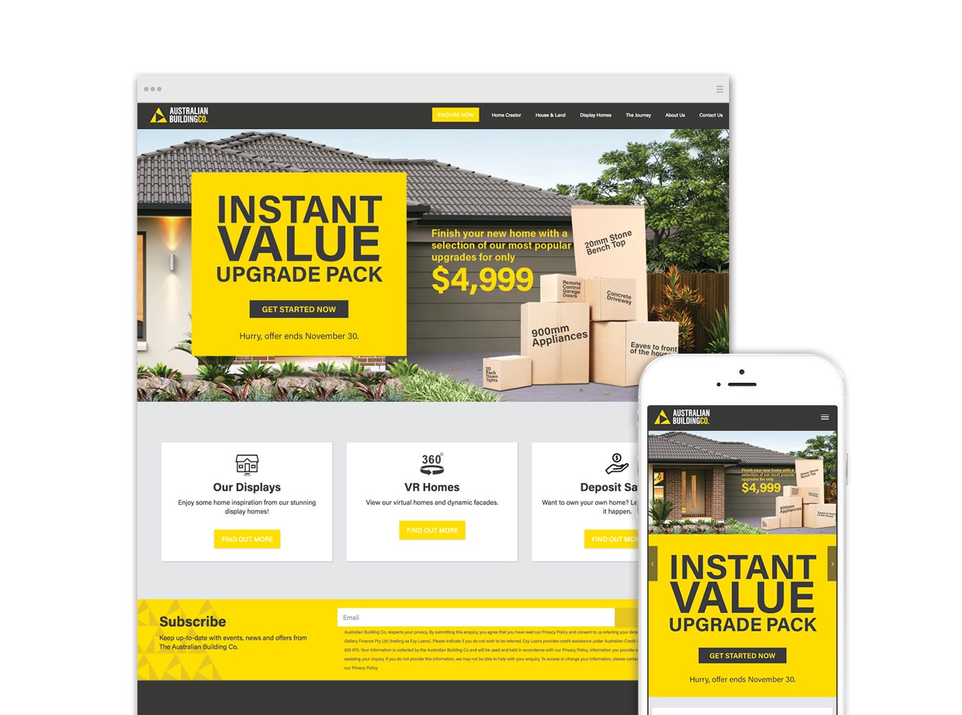
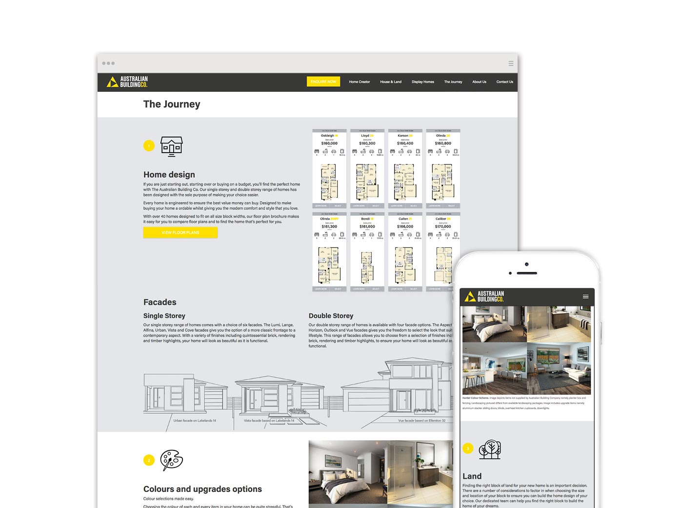
The content and design strategy for the website was to make it as easy as possible for users to get the info they were after. WITHOUT having to fill in forms and submit requests for prices. We believed that if you give the consumer the facts, and your product is right for them, it will result in a quality lead.
The result was a series of features that put the user in control.
easy to use
Designed with user experience as our primary concern. Driven by consistent navigational elements coupled with a stand out yellow lead generating calls to action.
beautiful user interface
The site needed to reflect the visually striking nature of the product by, not only showcasing product first, but by the design of the Graphical User Interface itself.
responsive experience
The site was designed with a fully responsive interface to ensure the perfect experience on mobile, tablet and desktop. Which was also key to maximising SEO.
Home Creator
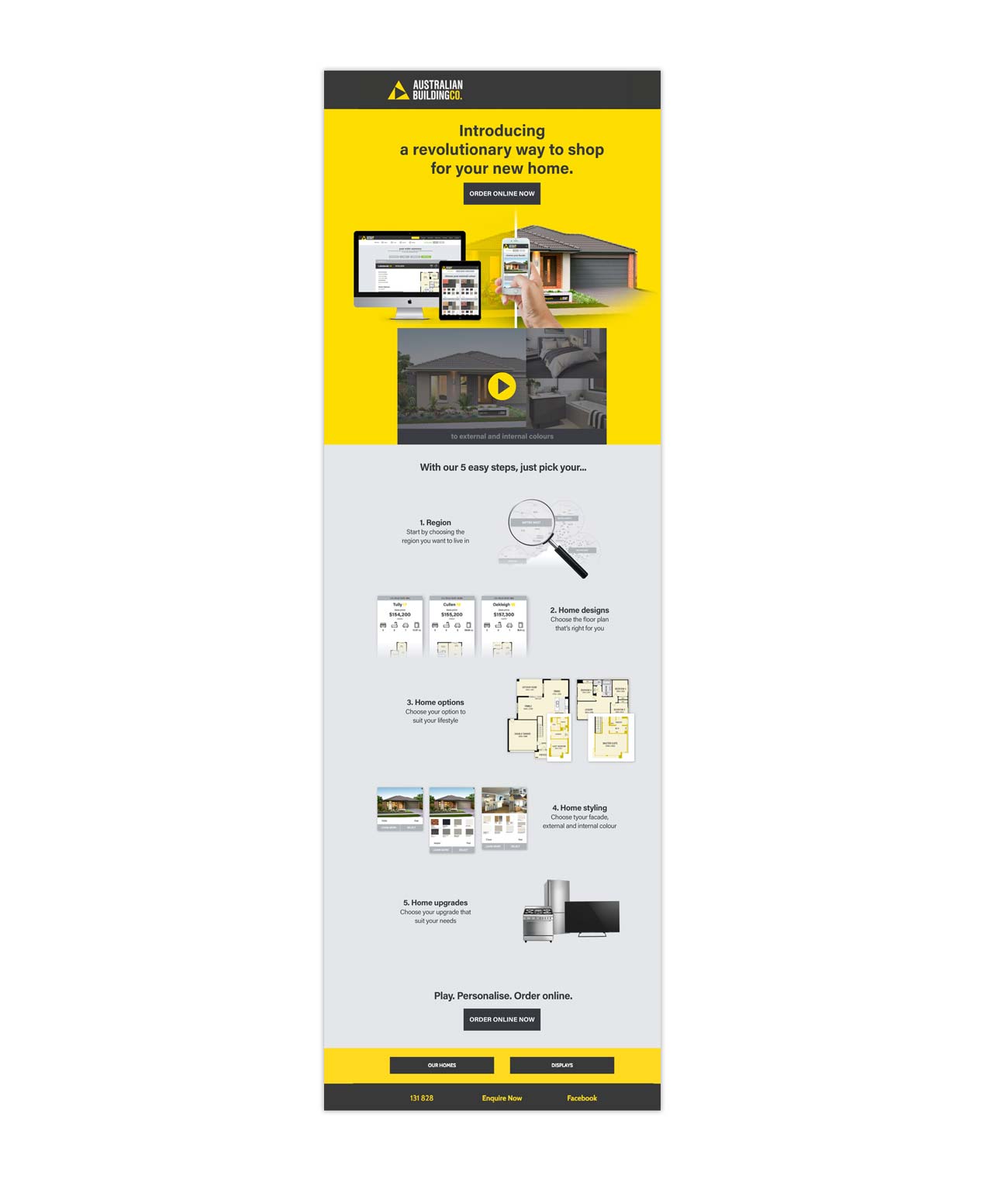
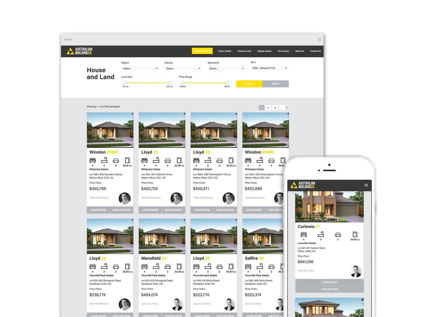
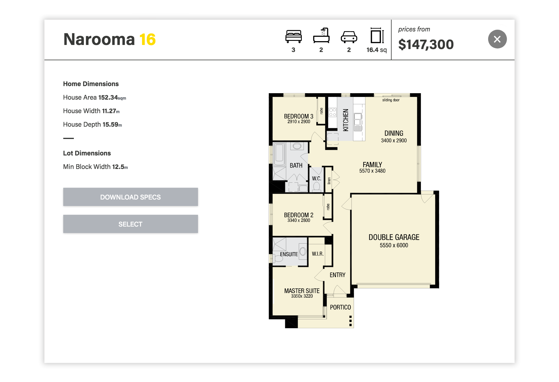
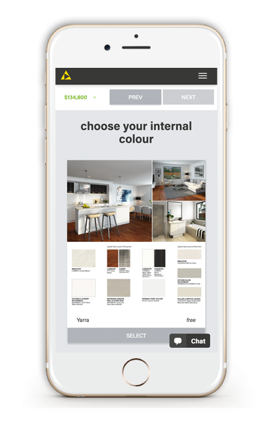
The home creator put floorplans upfront with powerful filters allowing users to find the perfect floorplan. It then walked them through all the steps to picking the right home - floorplan options, facades, colours and upgrades, all while the price automatically updated as they went. The Australian Building Co was the first home builder to introduce such a revolutionary way to shop for your home online.
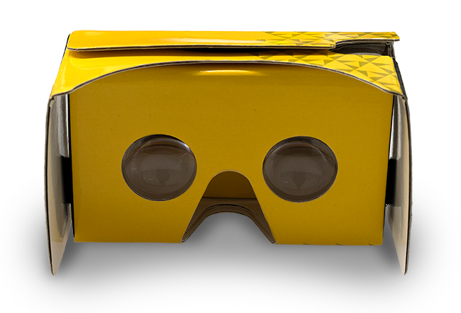
Virtual Homes
The first home builder to introduce virtual reality to help customers select the right facade and colours for their home. Usable with Google Cardboard Viewers and available at any display, or in conjunction with any VR headset.
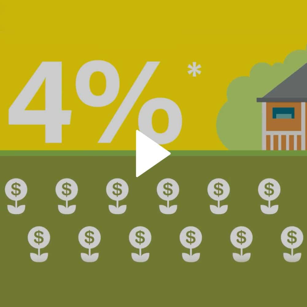
Rent investor

Home creator
Using motion graphics to increase awareness
As part of our content creation strategy for our social media marketing and website we developed a series of videos to help educate customers about various topics, including options for investment and how to use our ground breaking website features.
the outcome
This project was as challenging as it was rewarding. Although the business existed, it didn’t have a brand that resonated with consumers, and a marketing and communications strategy that allowed it’s messages to penetrate a saturated market.
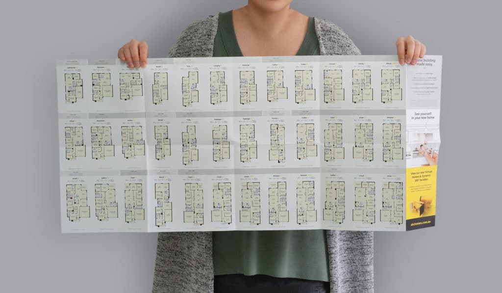
From the initial positioning workshop through to launch in market, only took 5 months. The first 2 months included developing the brand, positioning and a marketing strategy. And then in the following 3 months we brought it all to life. In head office with all communications, pricelists, floorplans and contracts. In displays with all new design, layout and POS. Online with a complete new website. And finally to above the line marketing with outdoor campaigns.
The resulting brand, positioning and advertising has since been successfully communicated in market with results that have exceeded our wildest projections.
We believe in employing long term strategies and, as true guide of success, the following statistics compare the 6 months prior the launch of the rebranding and new communication strategies to the same period 1 year later.
The above figures clearly show the brand and marketing strategies resonating with consumers, resulting in an increase in interest and leads. Often a positioning will resonate with consumers, but it isn’t a true reflection of the business itself. As a result the promise doesn’t marry with reality and enquiry doesn’t convert to sales.
The following figures are comparing the same periods...
you might also like
VIEW CASE STUDY
Springfox
Rebranding and relaunching an international brand for an Australian market.
VIEW CASE STUDY
want to work with us?
want to work with us ?
or call us on
Share this project
© 2017 WOOF CREATIVE
